Optimizing user flow to reduce churn in critical app scenarios
As a UX/UI Designer at Wabi Inc., I tackled a pressing issue that significantly impacted user retention: the HAID (Home All Items Disabled) scenario. This situation occurs when all nearby stores are closed, leading to empty product displays within the app. Through data analysis using Amplitude, we discovered that 19% of users who uninstalled the app had encountered the HAID scenario at least once, and 18.7% of new users experienced it during their first days. This issue primarily occurred on Sunday evenings, resulting in high levels of frustration and a sharp increase in app uninstalls. To address this, we undertook a comprehensive redesign of the user flow to mitigate the negative effects and improve overall retention.
Timeline
Client
Role

The problem
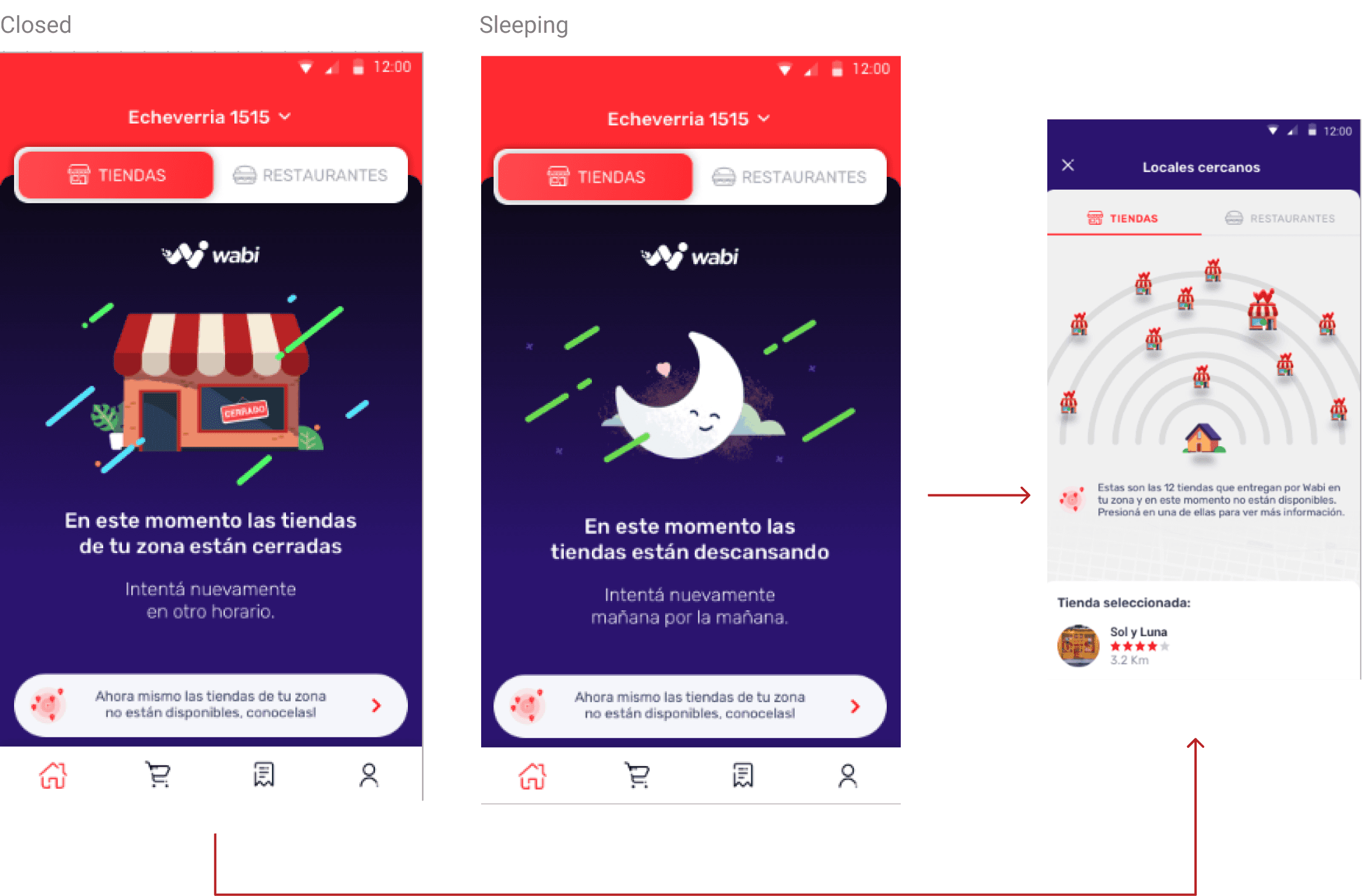
While working as a UX/UI designer for Wabi Inc., I encountered a significant challenge within the app: the HAID (Home All Items Disabled) scenario. This situation occurs when all nearby stores are either closed, on break, or penalized, resulting in no products being displayed in the app.
Through data analysis using Amplitude, we discovered that 19% of users who uninstalled the app had experienced this scenario at least once within a 30-day period. Additionally, 18.7% of new users encountered the HAID scenario during their first days on the platform, leading to frustration and drop-offs. The issue was particularly prevalent on Sundays between 7 PM and 11 PM, when most HAID events were reported. This negatively impacted user retention and loyalty, making it a critical issue to address.
Objective
The main goal of this project was to reduce app uninstalls by mitigating the impact of the HAID scenario. This would help improve user retention and foster long-term loyalty to the Wabi platform.
Product discovery
After identifying the HAID issue, we collaborated with teams from Marketing, Front-End, Product, Back-End, and UX/UI to begin defining potential solutions. To approach this challenge from different perspectives, we kicked off the process with a brainstorming session that included all teams. The goal was to generate a wide range of ideas without worrying about technical feasibility at first. This allowed us to explore innovative solutions from every angle.

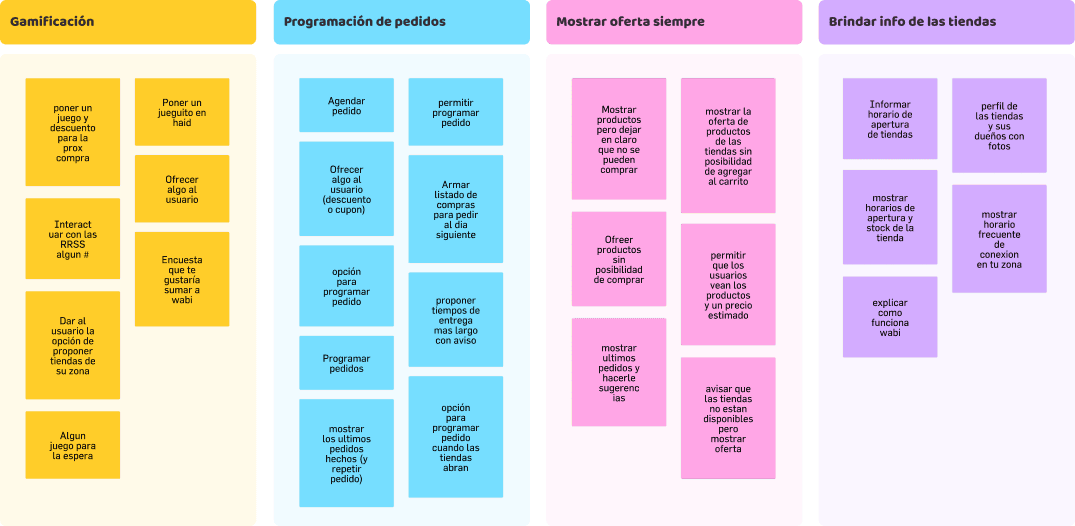
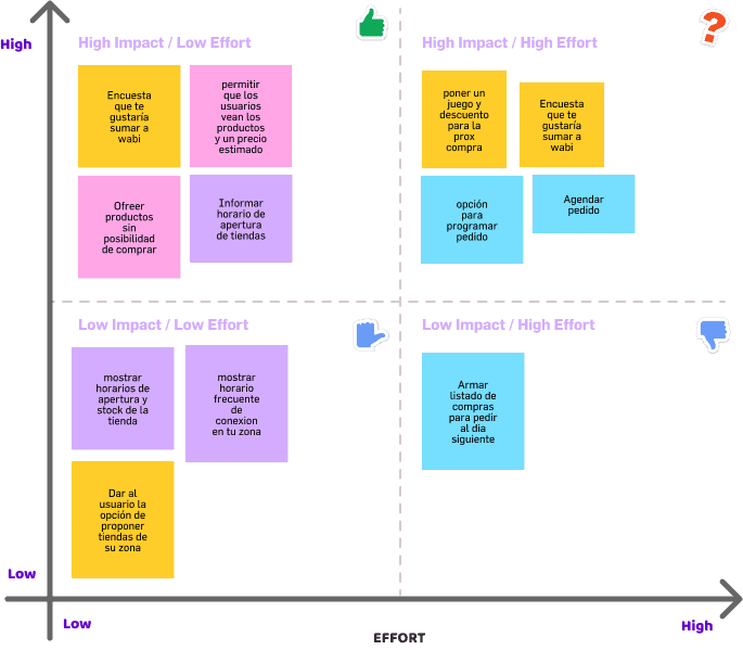
Once we had a diverse pool of ideas, we organized them into clusters to evaluate their feasibility. By grouping similar concepts, we could analyze each cluster's potential to solve the problem effectively. We then applied an impact-effort matrix to assess the viability of the proposed solutions, allowing us to prioritize ideas that could be implemented efficiently in the upcoming sprints.
This multidisciplinary approach not only fostered creativity but also ensured that the proposed solutions addressed the problem holistically, considering both user needs and technical constraints.
User Insights
As part of our UX efforts, we conducted a user survey using Braze to better understand the motivations of users who encountered the HAID scenario. The goal was to gather qualitative insights that would help us refine our approach and develop solutions that truly resonated with users' needs. The survey was launched over a 48-hour period, during which we collected 1,897 responses.
These responses provided valuable insights into the reasons users turned to our app, as well as the pain points they experienced when faced with unavailable products. Analyzing this data allowed us to align our proposed solutions more closely with user expectations, helping to reduce frustration and improve overall retention.

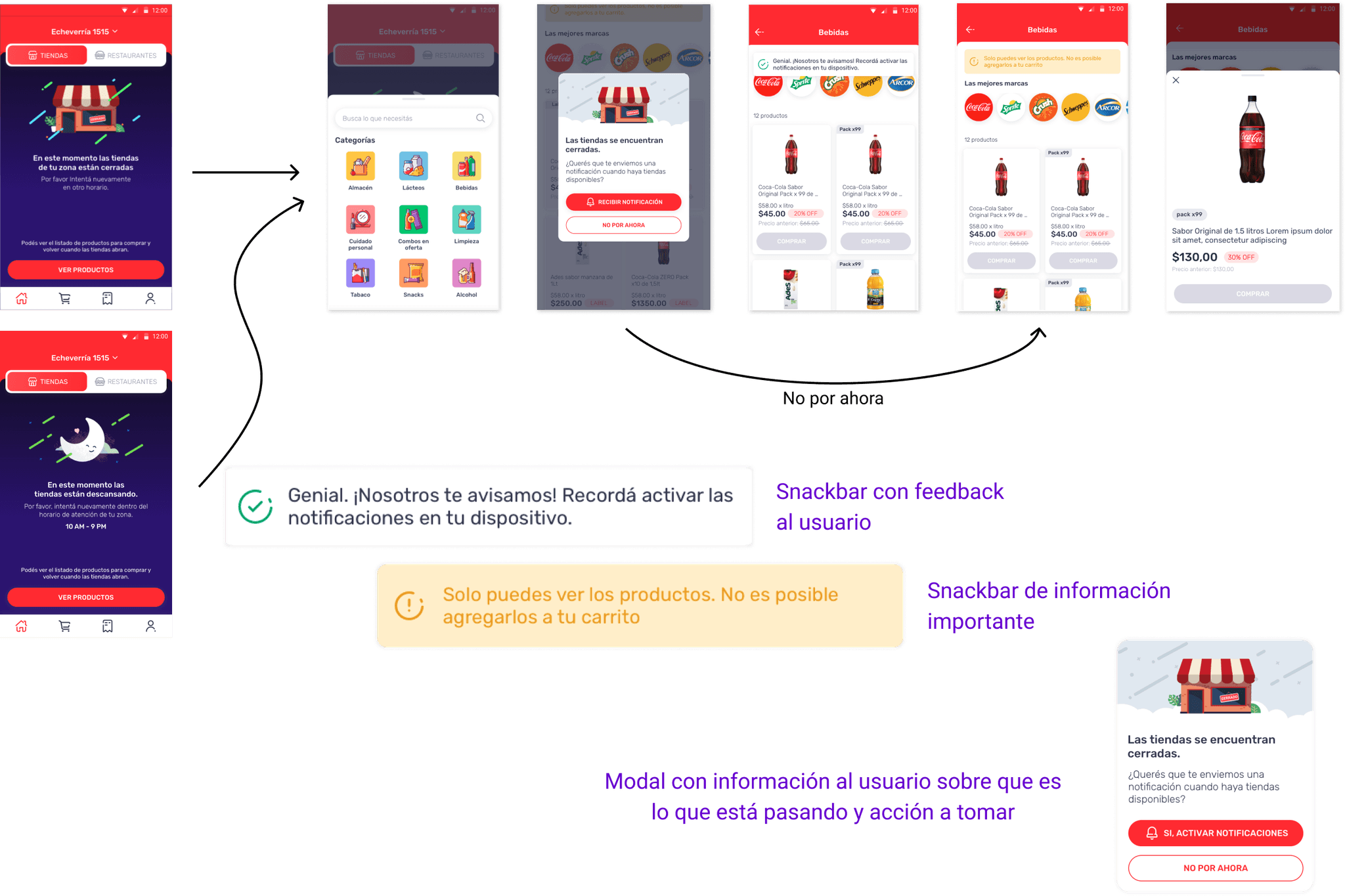
Re-design user flow
To address the HAID scenario effectively, we collaborated closely with the UX Writing team to design a new user flow. The goal was to guide users through the app, improving their understanding of where they were, what options they had, and how they could take action.
This redesigned flow focused on clarity and ease of use, ensuring that users were never left feeling lost or frustrated. The UX Writing team played a key role in crafting clear, concise messaging that supported the visual design, making it easier for users to navigate the situation and find solutions.
By pairing thoughtful design with strategic UX writing, we were able to create a more intuitive experience that kept users engaged even when products weren't immediately available.
Results
The new design yielded significant improvements in both user retention and product performance. Within two weeks of implementing the solution, we reduced app uninstalls by 7%, and by the end of the first month, uninstalls had decreased by 10%.
We also enhanced the wording on key screens, ensuring that the app’s value proposition was clearly communicated to users, which helped improve user engagement and reduce drop-offs during critical moments.
From a product perspective, these changes contributed to an increase in user retention, a key metric for driving long-term growth and engagement. By reducing churn and reinforcing user trust, we positively impacted business metrics, including overall transaction volume on the platform.