New paymenth method
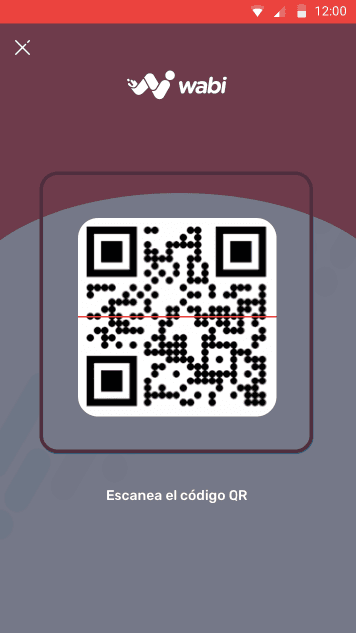
In 2022, as a UX/UI Designer at Wabi, a startup backed by Coca-Cola, I tackled the challenge of redesigning the QR payment experience for Wabi2U, our B2C marketplace operating in highly competitive markets across Latin America and Asia. The goal was clear: enhance security, efficiency, and user satisfaction during the payment process.
Timeline
Client
Role
Objectives
The redesign aimed for three main improvements: to increase users' sense of security, streamline delivery times, and simplify the payment process. These goals were set not only to enhance user experience but also to optimize logistical operations and increase conversion rates on the platform.
Design and Development process
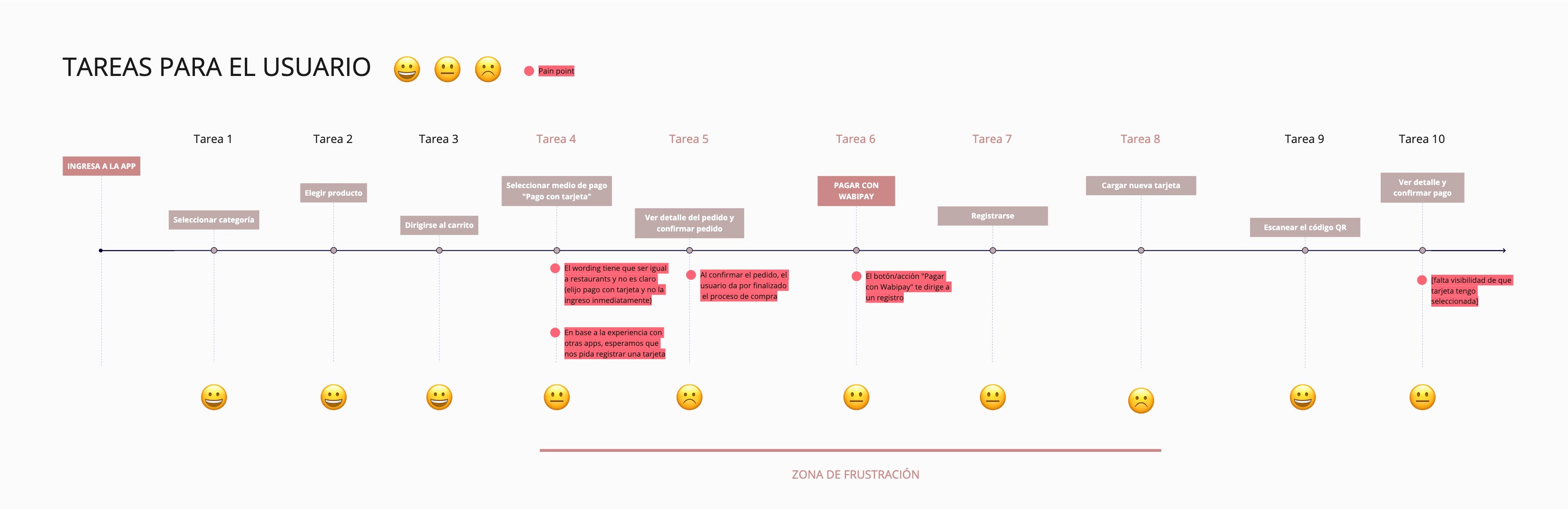
I employed the Design Thinking methodology to structure the project, ensuring a user-centric approach from conception to implementation. This involved identifying key tasks and pain points through the task flow, which helped prioritize improvement areas. Additionally, creating a proto-persona based on quantitative data and stakeholder interviews was crucial for guiding our design decisions.


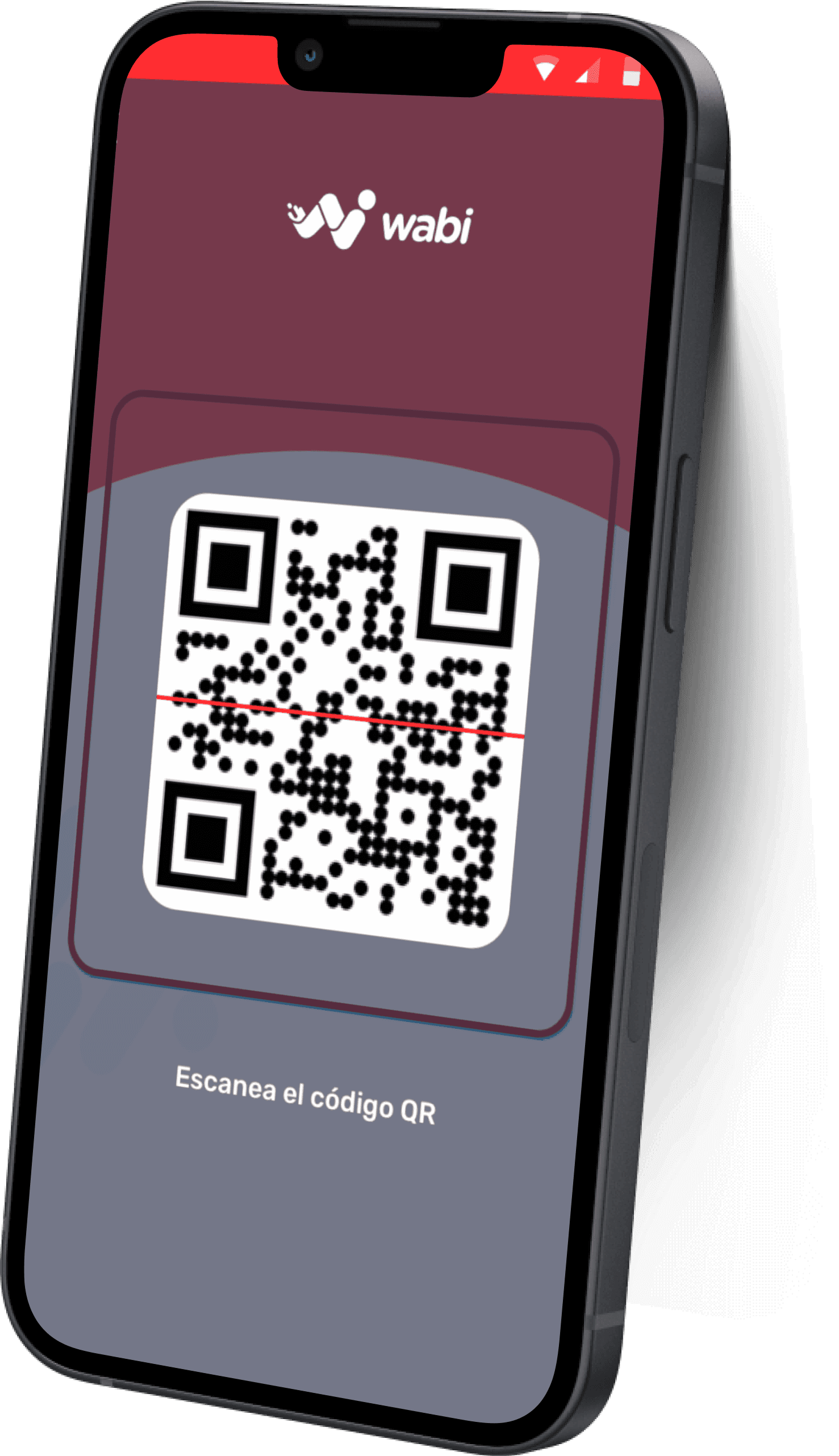
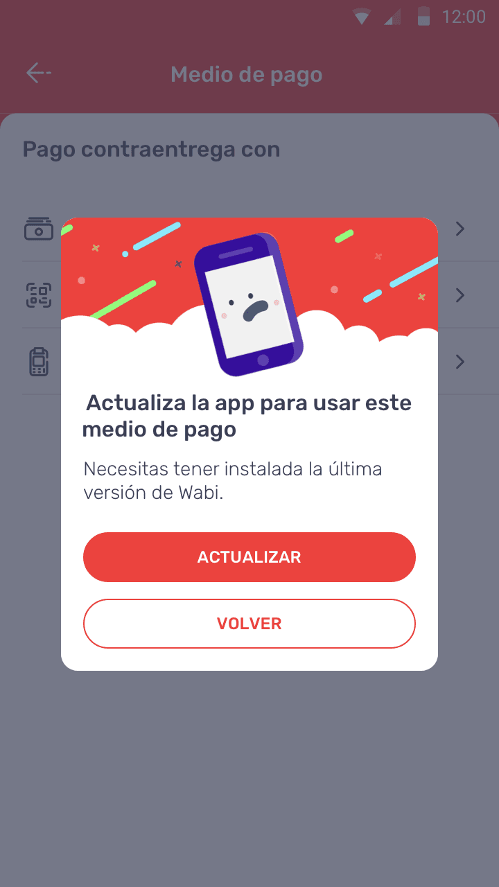
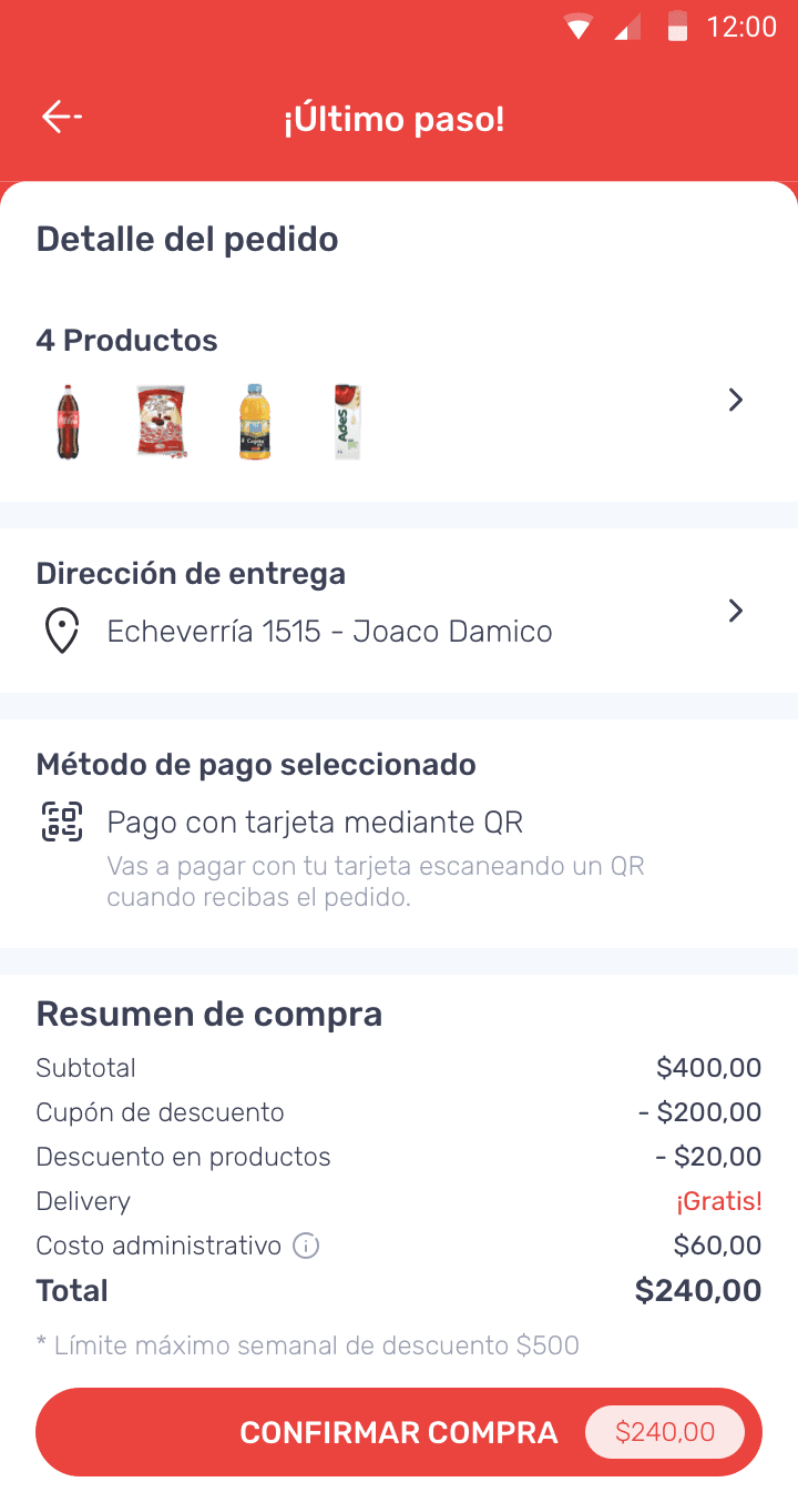
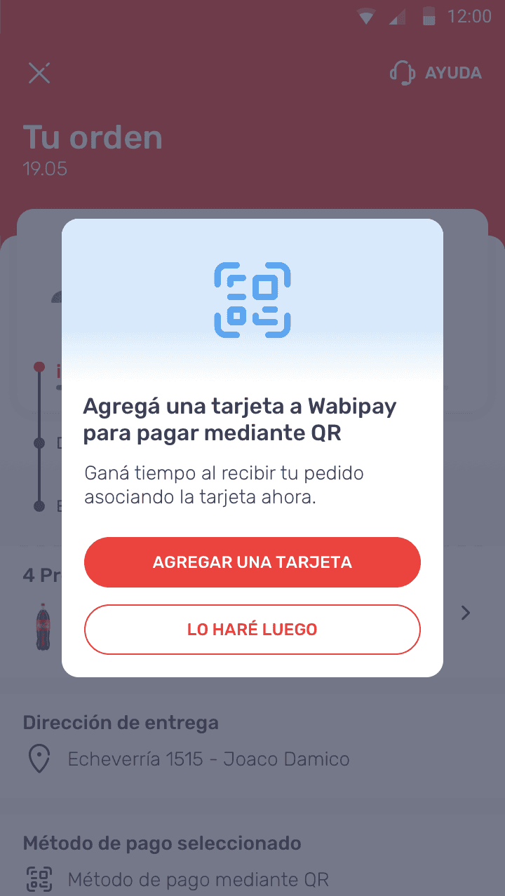
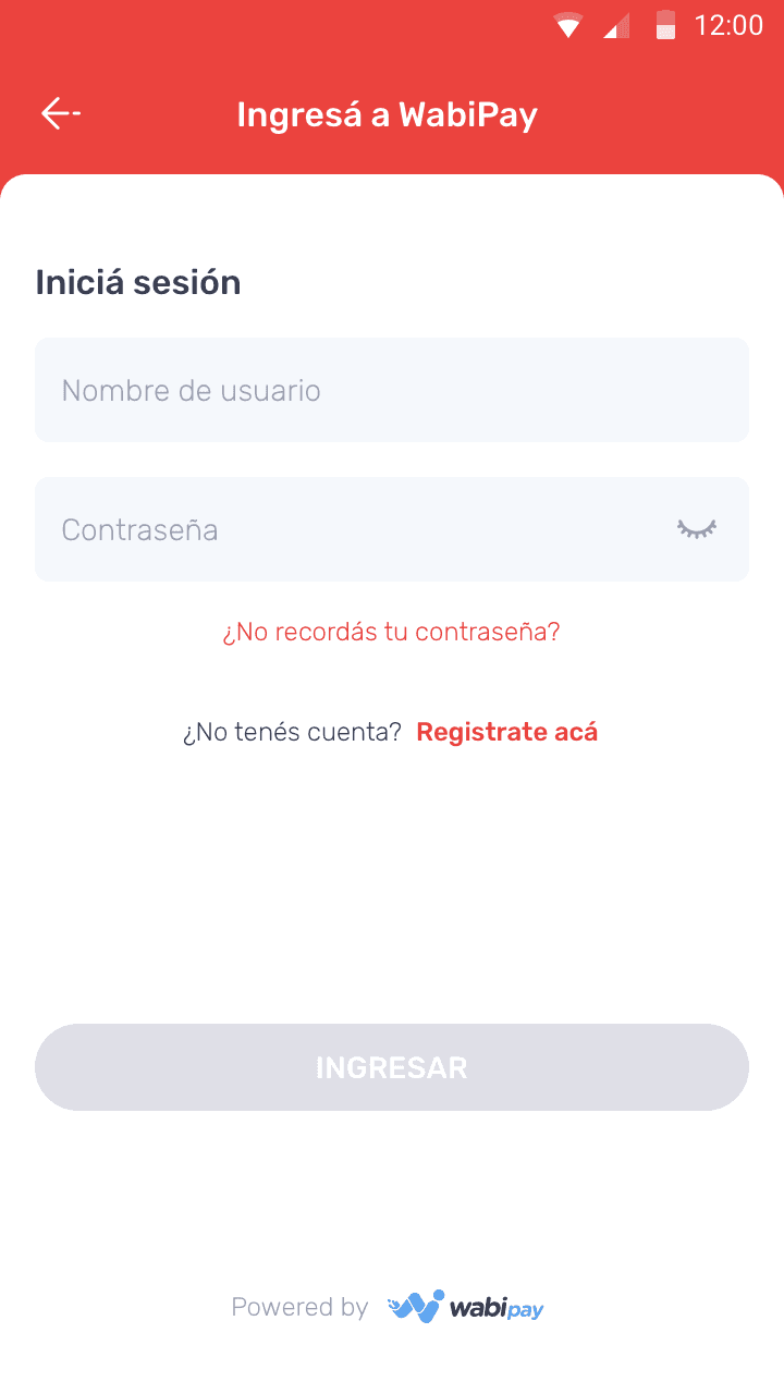
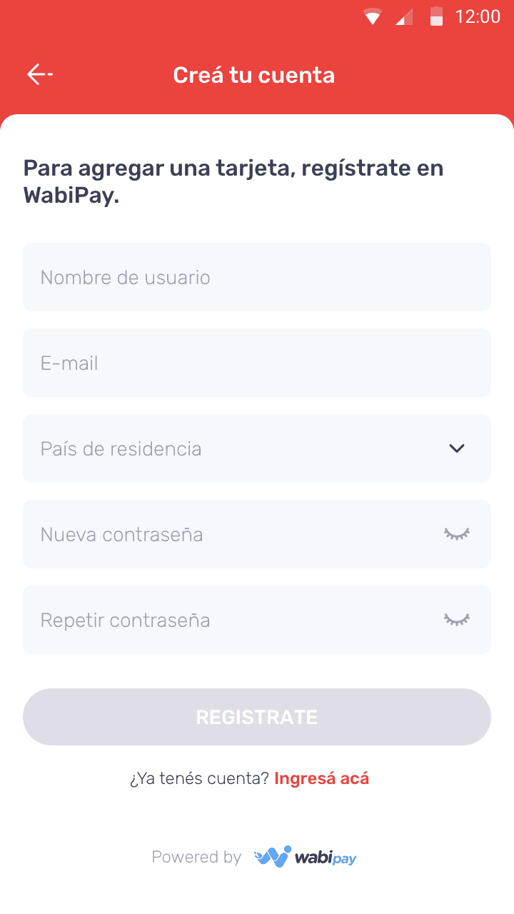
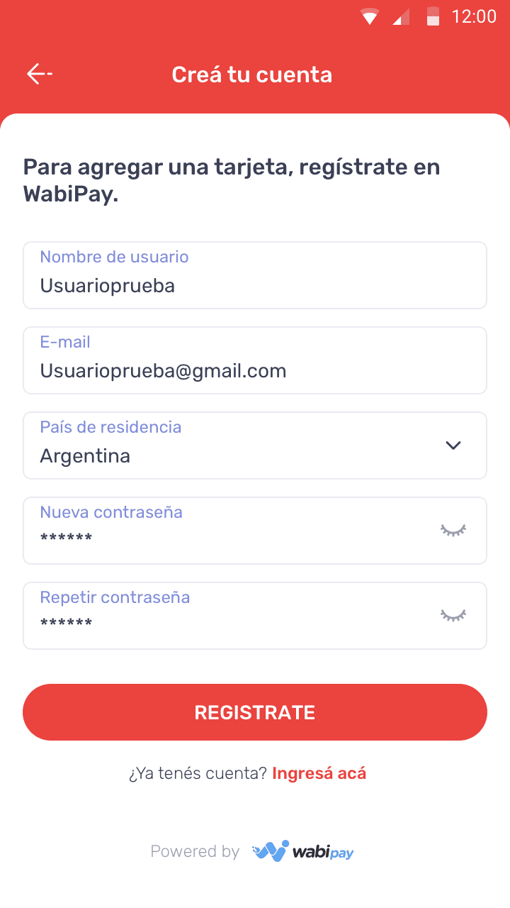
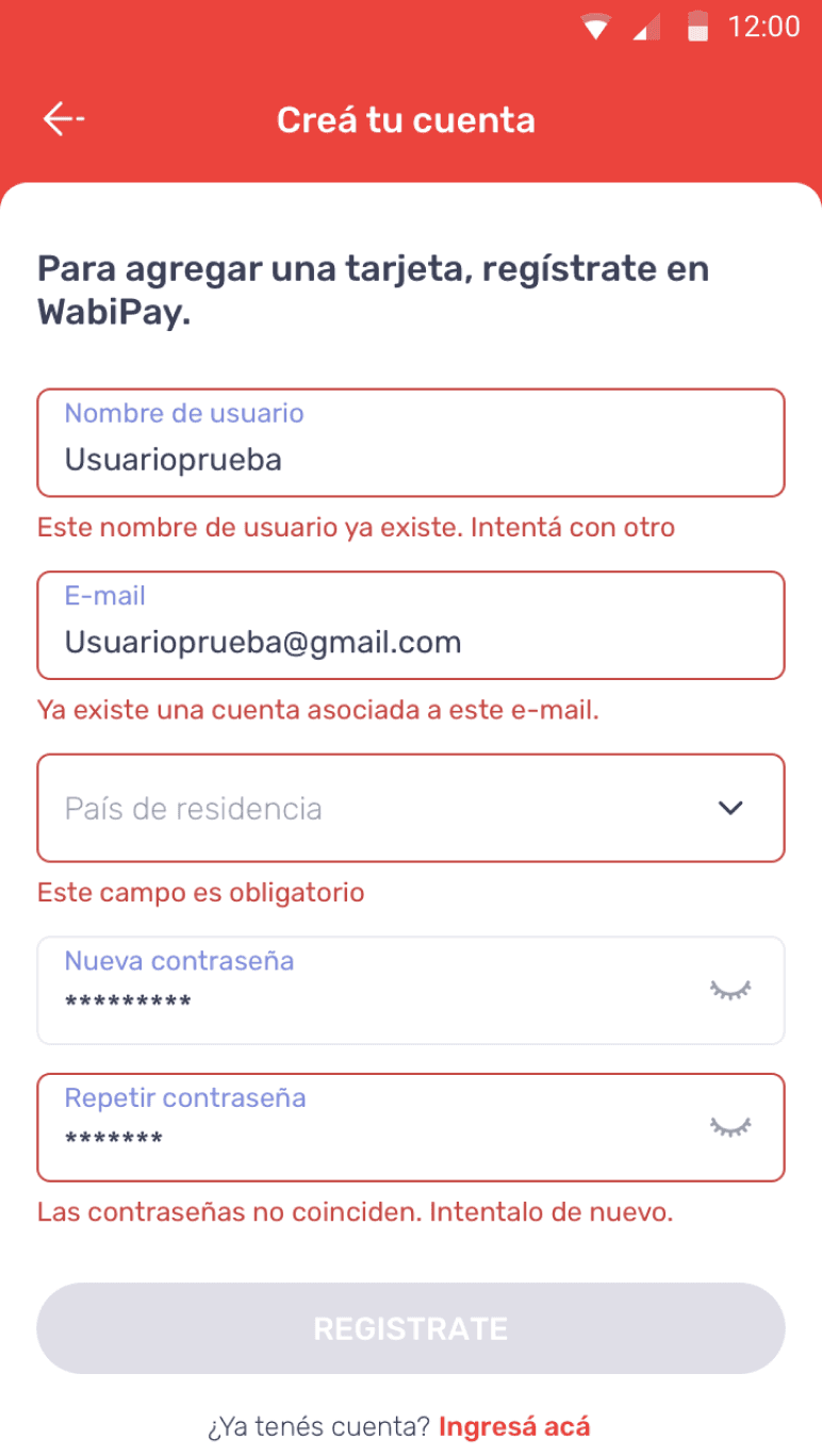
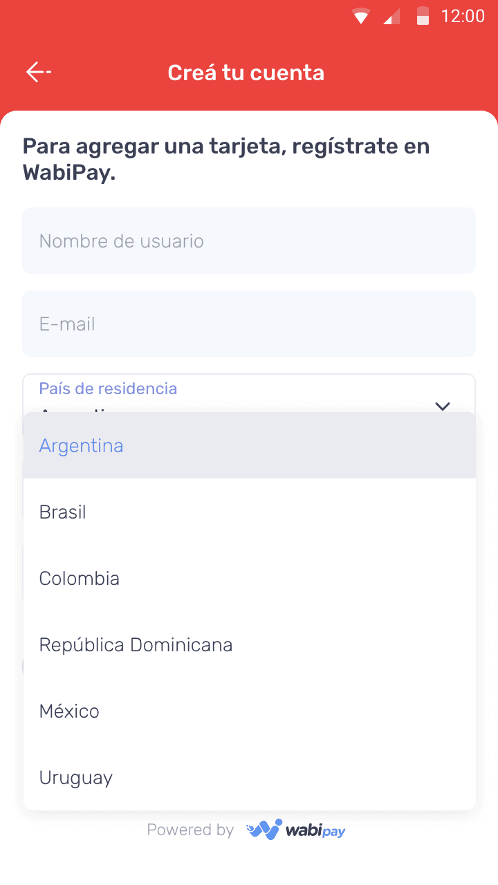
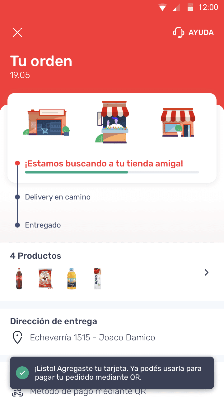
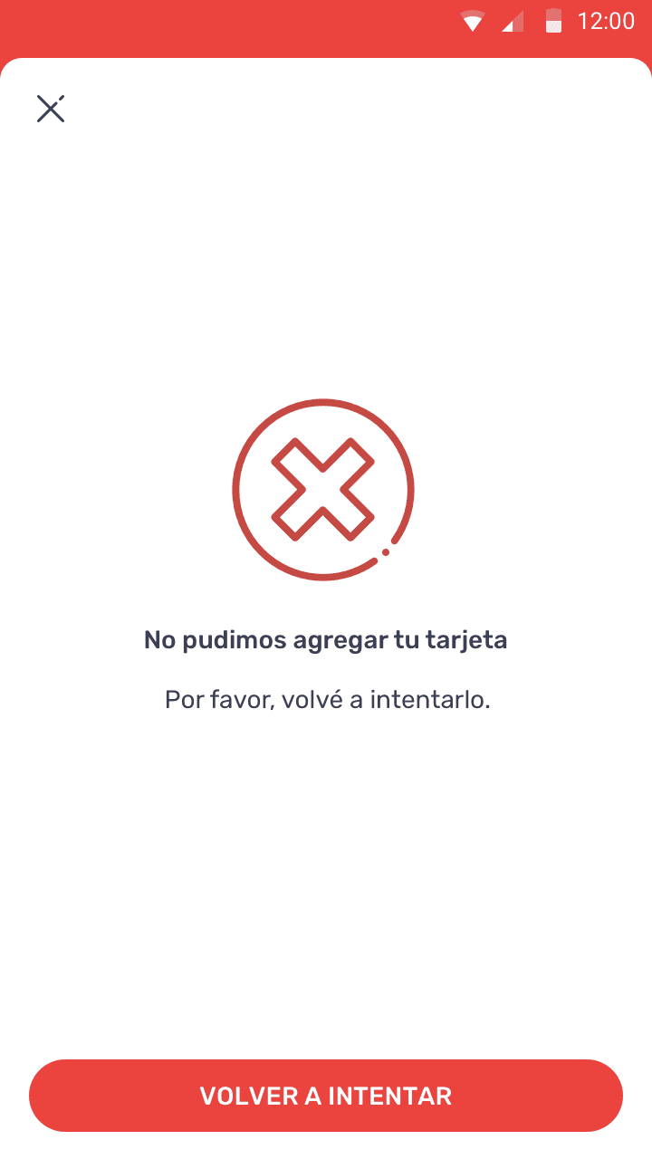
Implemented solutions

Results and Evaluation
The redesign resulted in a 8% reduction in the abandonment rate at the payment point, a clear testament to the positive impact of our work. Furthermore, A/B testing showed a significant improvement in user satisfaction with the payment process, reflecting the success of our user-centered interventions. Additionally, we saw a 15% increase in user retention after their first purchase, indicating that users were more likely to return after experiencing the improved payment flow. The new design also led to a 20% improvement in payment processing efficiency, reducing the number of errors during transactions and lowering the volume of payment-related support tickets.
Lessons learned and reflections
This project reaffirmed the importance of an iterative, user-focused approach. I learned the significance of communicative clarity in critical interfaces and how careful design can directly influence users' perceptions of security and efficiency. These lessons are vital in my ongoing development as a UX/UI Designer, influencing how I approach design challenges and collaborate with multidisciplinary teams.